- Simon Bromander on Product & UX
- Posts
- Building an Advanced E-commerce Filtering Prototype with Claude and Lovable
Building an Advanced E-commerce Filtering Prototype with Claude and Lovable
Simon Bromander
March 30, 2025
In this post, I'll walk you through my detailed process (using a fictional case study) of how I built an e-commerce prototype to test different filtering layouts using Claude and Lovable. You'll see exactly how AI tools can dramatically speed up the prototyping process while maintaining high-quality results.
Test the prototype yourself here:https://grocery-gateway-compare.lovable.app/
It is not perfect, but I did build this in less than 30 minutes.
Summary
Used Claude to create a comprehensive PRD for an e-commerce filtering prototype
Implemented two different filter UI layouts (sidebar and horizontal) for comparison testing
Successfully built a functional prototype with Lovable despite some initial challenges
Added real-time filtering, layout switching, and shopping cart functionality
Step 1: Creating the PRD with Claude
I started by asking Claude to write a comprehensive PRD (Product Requirements Document) that I could provide to Lovable. My prompt was specific about what I needed:
Create a E-commerce site comparing two different filter UI layouts for an online grocery store:
1. Traditional sidebar filtering (vertical left sidebar)
2. Horizontal filtering bar across the top

Include:
- Toggle switch to alternate between layouts
- 15-20 grocery products across categories (Produce, Dairy, Bakery, Meat, Beverages, Snacks)
- Product details: name, image, price, category, dietary tags, rating
- Functional filters that update in real-time: categories, price range slider, dietary preferences, ratings, sort options, and sale toggle
- Responsive design for desktop and mobile
- Clean modern aesthetic with green (#4CAF50) and amber (#FFC107) color scheme
- Clear visual hierarchy and uniform product images

Implement proper state management to persist filters when switching layouts and include metrics tracking hooks for future analysis.
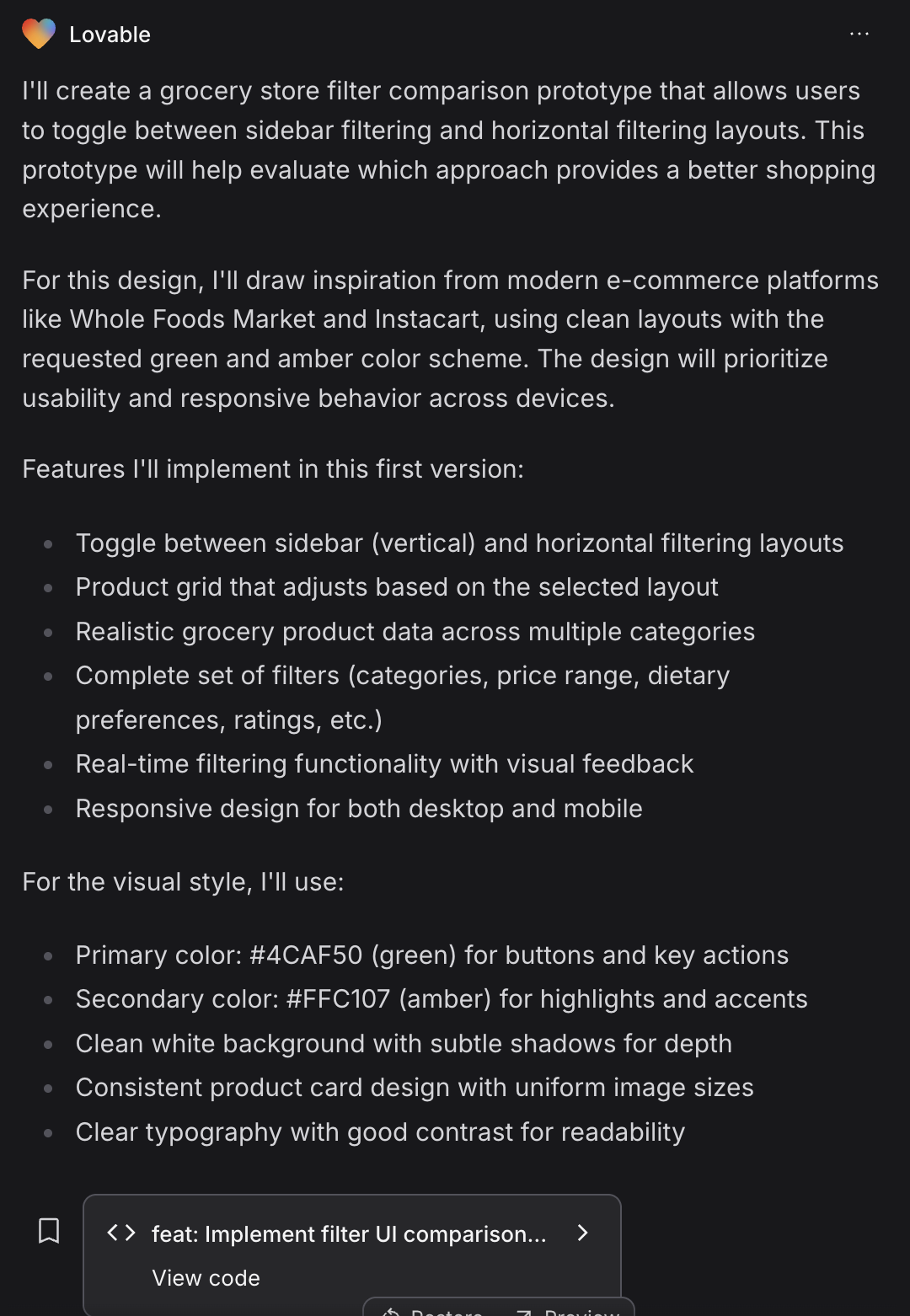
Step 2: The Generated PRD
Claude delivered a detailed PRD that covered all the requirements:
Grocery Store Filter UI Comparison Prototype
Context
The document explained the need to prototype and compare two filter UI approaches to determine which provides a better user experience.
Requirements
Toggle switch between filtering approaches
Realistic grocery product data (15-20 items)
Working real-time filter functionality
Responsive design for desktop and mobile
Product Data Details
Categories: Produce, Dairy, Bakery, Meat, Beverages, Snacks
Product attributes: name, image, price, category, dietary tags, rating
Realistic price ranges and sale items
Filter Options
Price range (slider)
Dietary preferences (checkboxes)
Categories (checkboxes)
Ratings (stars)
Sale toggle
Sort options (dropdown)
UI Layout Details
The PRD included specific details for both layouts, with considerations for desktop and mobile views, as well as interaction patterns.
Visual Style
Primary color: #4CAF50 (green)
Secondary color: #FFC107 (amber)
Clean, modern aesthetic with ample white space
Metrics and UX Considerations
The document also covered metrics to track and important UX factors to consider.
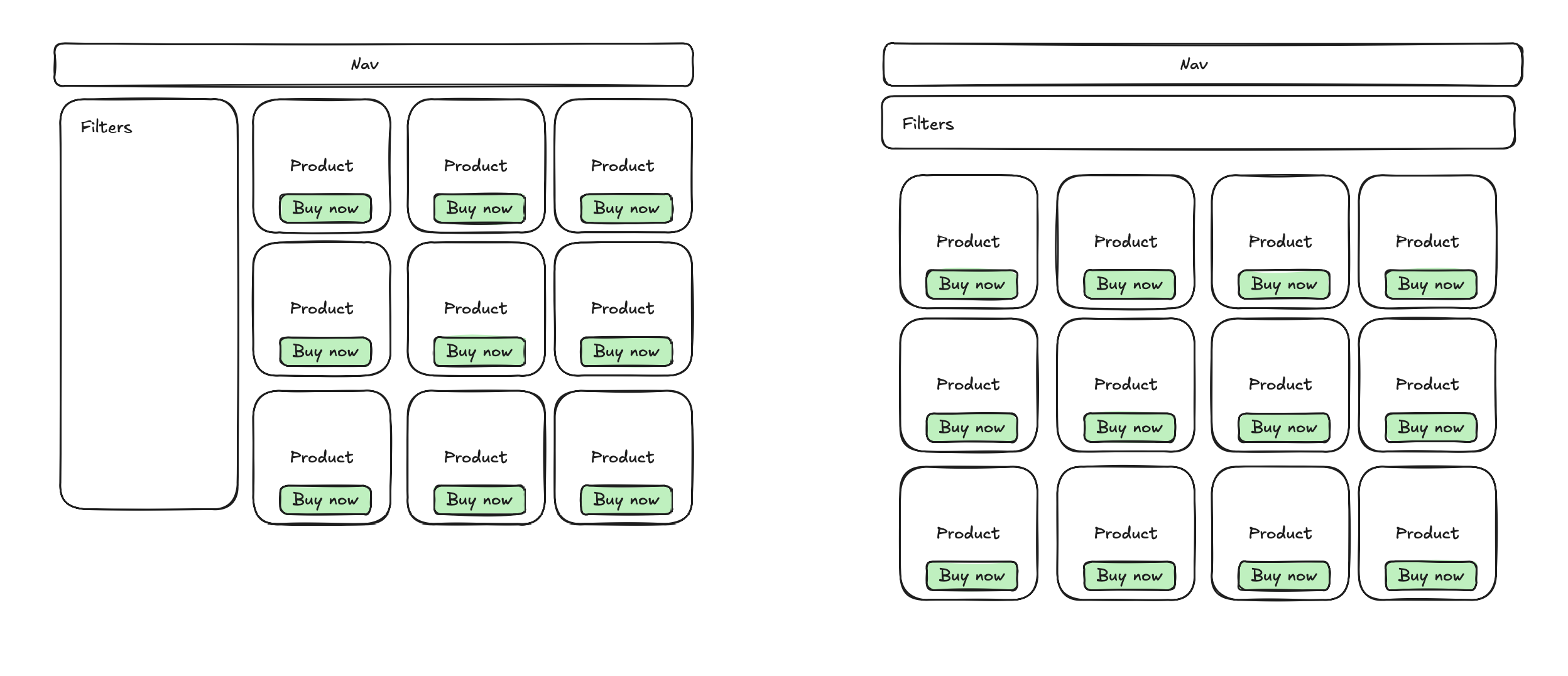
Step 3: Creating a Simple Sketch
I added a simple wireframe sketch to visualize the two layouts:
Step 4: Working with Lovable
I provided both the PRD and sketch to Lovable to start building the prototype. My expectations were high since this is a common interaction pattern in e-commerce.
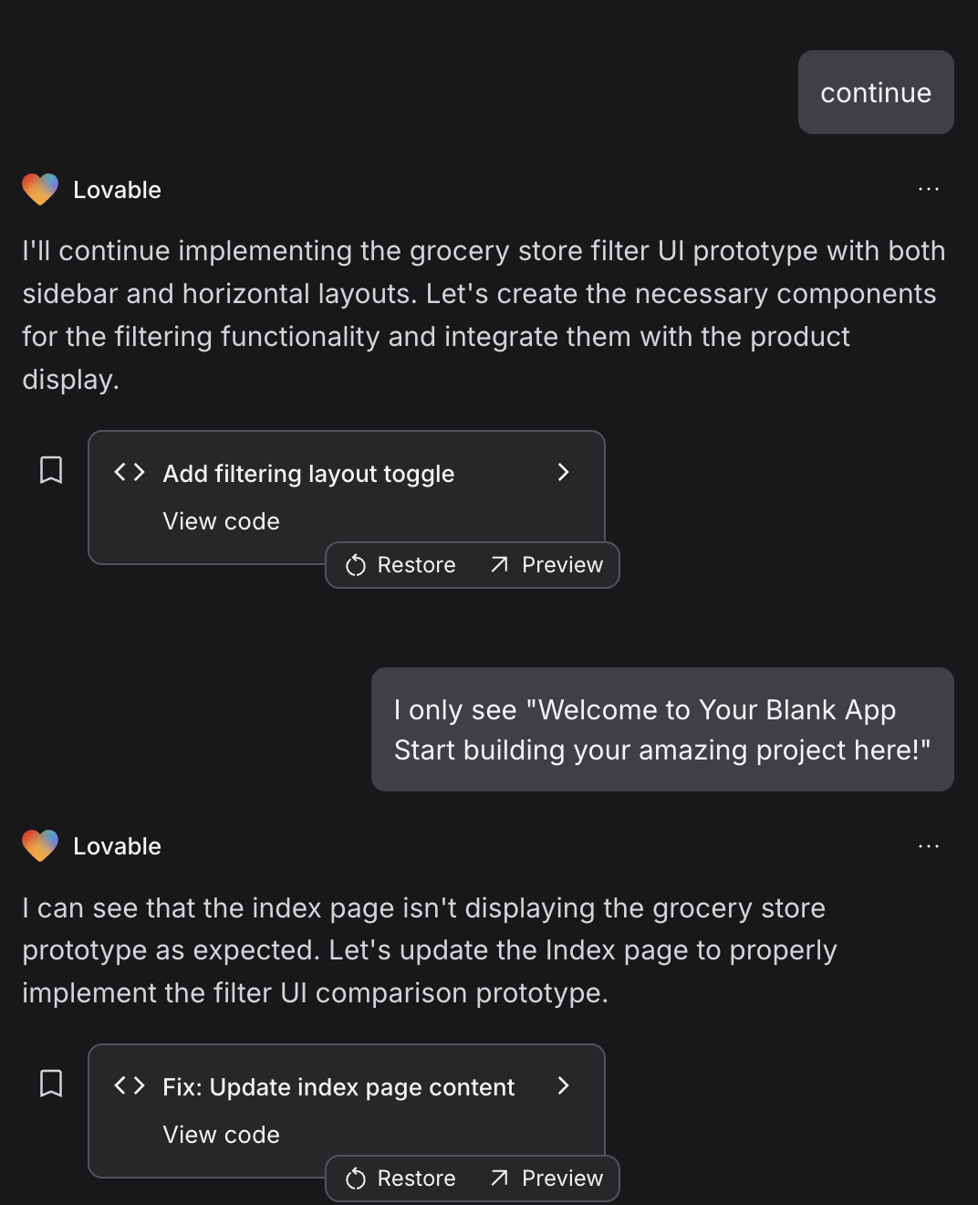
Step 5: Challenges
I encountered a few errors during the build process, with Lovable aborting the task a couple of times:
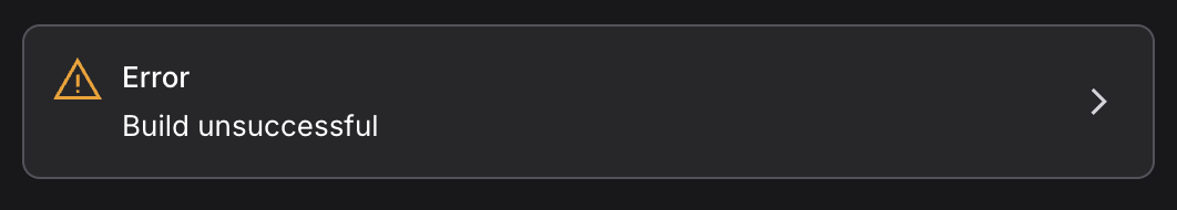
However, I persisted by simply asking Lovable to continue building, and we eventually got past the errors.
Step 6: The Functional Prototype
After a few iterations, Lovable delivered a working prototype with:
Both filtering layouts (sidebar and horizontal)
Real-time filter updates
Toggle switch to alternate between layouts (see lower right corner)
Responsive design
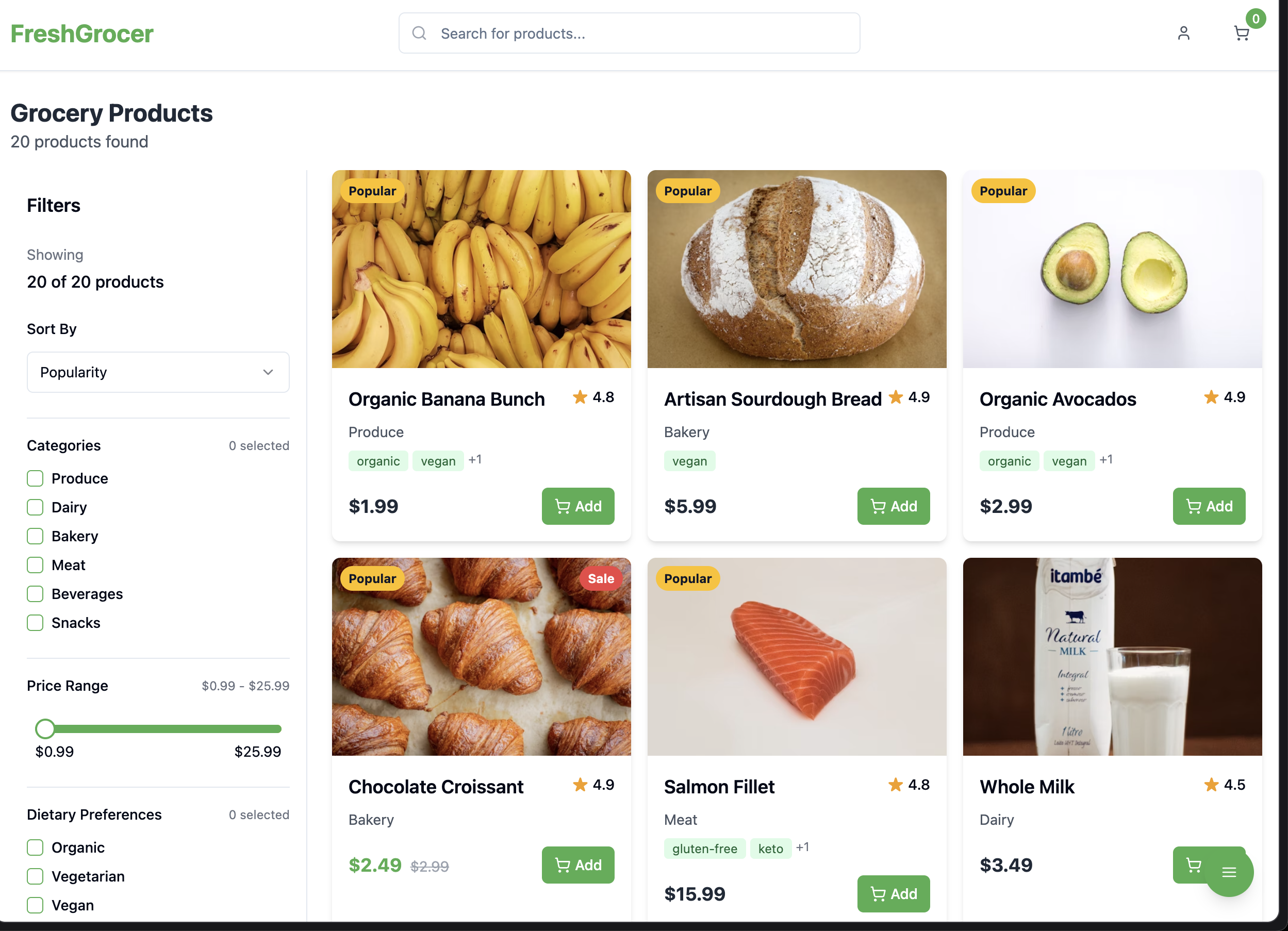
Vertical filters in sidebar
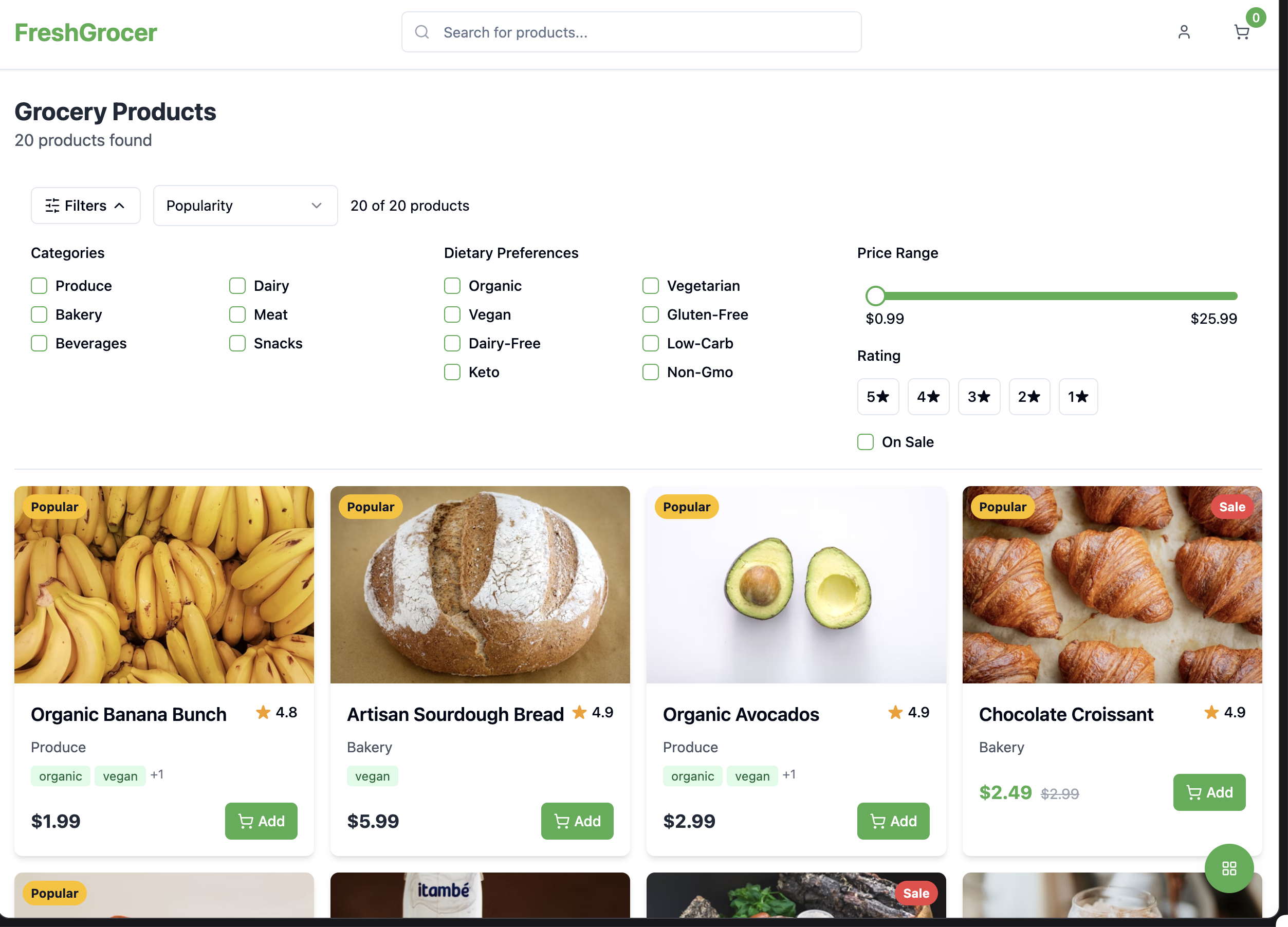
Horizontal filters above products
The filters worked perfectly out of the box, and I could switch between layouts using the button in the bottom right corner.
Step 7: Adding Shopping Cart Functionality
To push the prototype further, I asked Lovable:
Can we add functionality to add an item to the cart?
Lovable responded positively and implemented cart functionality:
"Let's implement the functionality to add items to the cart. We'll need to create a cart context, update the product card, and add toast notifications for user feedback."
A couple of minutes later I had a "add to cart button" on the cards, as well as "toast" message confirming that it has been added. The cart also counts the number of items I add.
Want to do "lo-fi" style? Just add the following prompt
Can you make this prototype more "lo-fi", more abstract and black/white? Remove all photos and use placeholder images.

Final prototype

Next steps
Would probably be to start building this as a flow, maybe add a start page, build out search functionality, etc.
Key Takeaways
AI-Powered Efficiency: Using Claude to generate a detailed PRD saved significant time in the planning phase.
Iterative Problem-Solving: Despite some initial errors, persisting with Lovable yielded excellent results.
Functional Prototyping: The final prototype included working filters, layout switching, and cart functionality—all without writing code myself.
UX Testing Ready: The prototype is now ready for user testing to compare the effectiveness of both filtering approaches.
This project demonstrates how AI tools can dramatically accelerate the prototyping process for UX designers, allowing for more rapid iteration and testing of design concepts.
Reply